Comms pros at environmental agencies spend years of their lives trying to get people to pay attention to air quality: How pollution is measured and regulated; what it does to your health. They do audience research, craft strategies, implement tactics and track metrics. No one seems to be listening.
Then a massive plume of wildfire smoke drifts in and parks itself over the usually clean-breathing Pacific Northwest, and we’re suddenly crashing the servers on air quality websites and crabbing about how there isn’t an air monitor on every street corner. It turns out smoke is the best outreach and education tool in the communicators’ toolkit.
But wildfire smoke is a serious subject, so I can only get so cheeky about it. My lungs hurt. I haven’t left the house in more than a week. Even with the house closed up, I’m worried about the damage to my daughter’s little lungs. I’m worried about construction workers, like my husband, who are forced to choose between a paycheck and exposure to hazardous conditions, and the unhoused who have no escape. And let’s remember why there’s smoke in the air in the first place: Catastrophic fires have taken lives and property, as if nature is screaming at us that climate change is here and it’s very real. All this while COVID-19, a deadly virus that attacks respiratory systems, continues to spread.
These are previously unimaginable conditions, and when it’s as horrible as this, people need immediate and easy-to-understand information, without investing loads of time and effort in background work.
The challenge for environmental communicators is often that our cadence is out of sync with the moment. We live and breathe this stuff (pun intended), and we have volumes of content to prove it. But people want to know what’s happening right now. When they can’t get it, the subject matter experts are stuck answering the same questions over and over. The accuracy of the information is called into question. Or worse, conspiracy theories bubble up. Here’s one of my favorites:
Because is a map of *US* fire data, you absolute imbecile. https://t.co/RIafSUibAb
— Carl T. Bergstrom (@CT_Bergstrom) September 14, 2020
My friends and former colleagues at the Washington Department of Ecology are doing an incredible job of keeping everyone informed. The map displays and blog posts are informative and authentic. The responses to reader questions are timely, personalized and helpful. Yet people continue to ask the same questions they always ask, and news reports capture the big picture (air quality is really bad) while citing different sources that can add to the confusion.
I don’t claim to be a subject matter expert, but I am a long-time environmental communicator who has probably tested the patience of many an atmospheric scientist and monitoring operator. Plus, my husband and 9-year-old daughter are sick of listening to me, so I’m bugging you with this instead. So if you’re stuck at home obsessively checking the monitors but not sure what it all means, I offer a little primer – some tips for how to make sense of the data, where to go for information, and how to keep yourself safe(ish).
What the colors and numbers mean
My mother-in-law sent my husband a text saying her friend’s air quality near Portland was something like 500 parts per million. That sounds bad! And when you open the state’s “dot map,” it looks like air quality in Issaquah is miraculously clean. How is that possible?
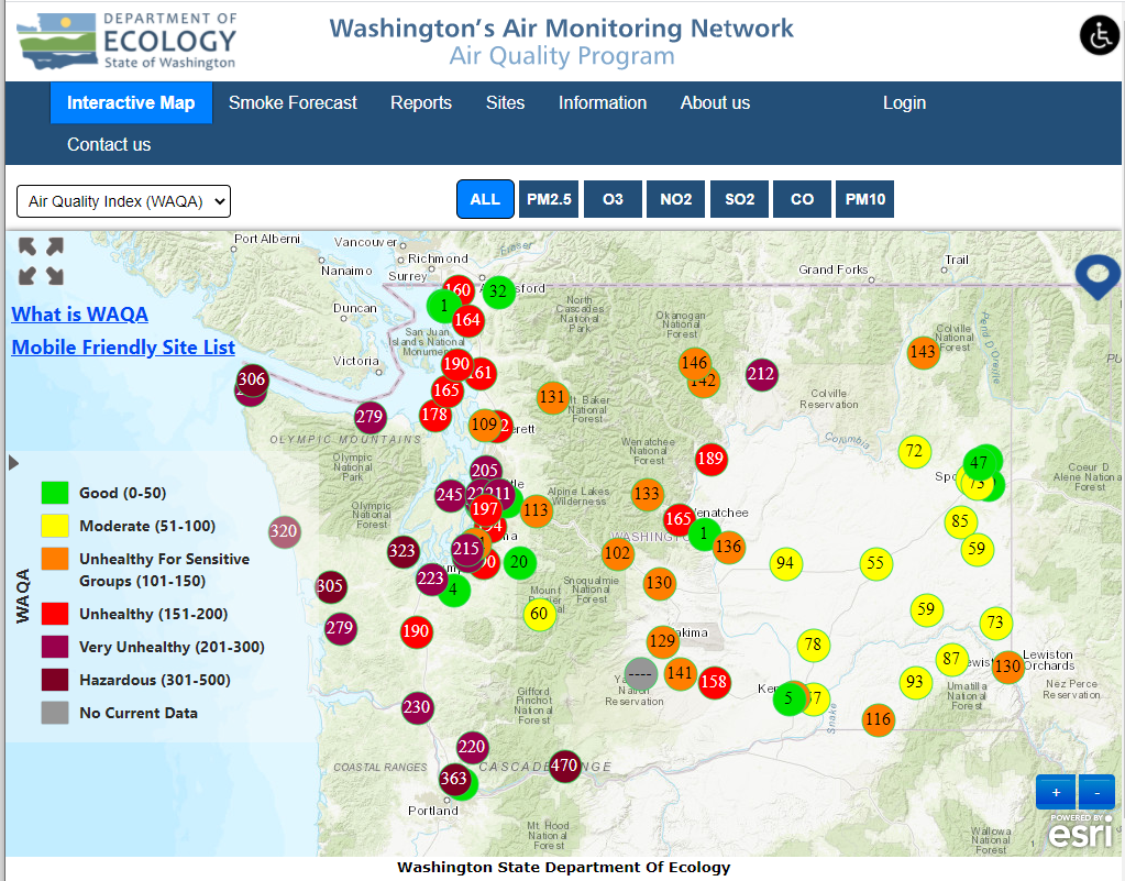
Mysterious islands of clean air in otherwise horrible smoke?
The first thing to know is that different air monitors measure different pollutants. When it’s smoky, you want to know how much particulate matter is in the air – specifically, PM2.5, or particulate matter that is about 2.5 microns in diameter or smaller. That’s 1/3 the diameter of a human hair. You may hear this referred to colloquially as soot. It’s not soot. You can see soot. You can’t see particulate, and that’s why it’s so dangerous. All those microscopic particles get inhaled deep in your lungs and absorbed in your bloodstream. The higher the concentration, and the longer you breathe it, the worse particulate matter is for your health.
PM2.5 is measured in micrograms per cubic meter (µ/m3). Without going into too much detail (because I don’t know that detail) the monitoring instrument measures the volume of tiny particles in a cubic meter of air. Does that mean my mother-in-law’s friend just got the units wrong? Probably not, because the concentration of particles isn’t the number you see on the dot map. What you see is a scaled value. The U.S. EPA and the Washington Department of Ecology take the recorded volumes and average them over 24 hours. Then they use an algorithm to translate them into a scale that has no units. I find this scaling just confuses most people, but no one listens to me. (Puget Sound Clean Air doesn’t bother with the scaled values, and I love them for that.) The argument for scaling is that if you assign nice round numbers to go with the colors, you can use the same scale for all the pollutants, even though they are measured differently and they pose different risks at different concentrations: 0 – 50 always means “Good,” 51 – 100 always means “Moderate,” etc.
So my mother-in-law’s friend probably had air quality that registered 500 on the air quality scale. That really is bad. Literally hazardous.
What about that miraculous green dot in Issaquah? Rule of thumb: If it looks too green to be true, it probably is. The Issaquah monitor measures ozone and only ozone. The good news is if you went to Issaquah to only breathe ozone, you’d be in good shape. But you should probably just toggle on only the PM2.5 dots.
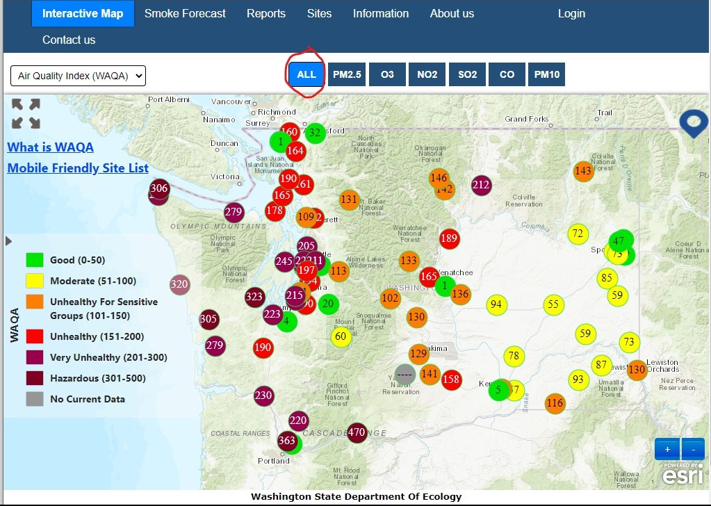
All monitors on…
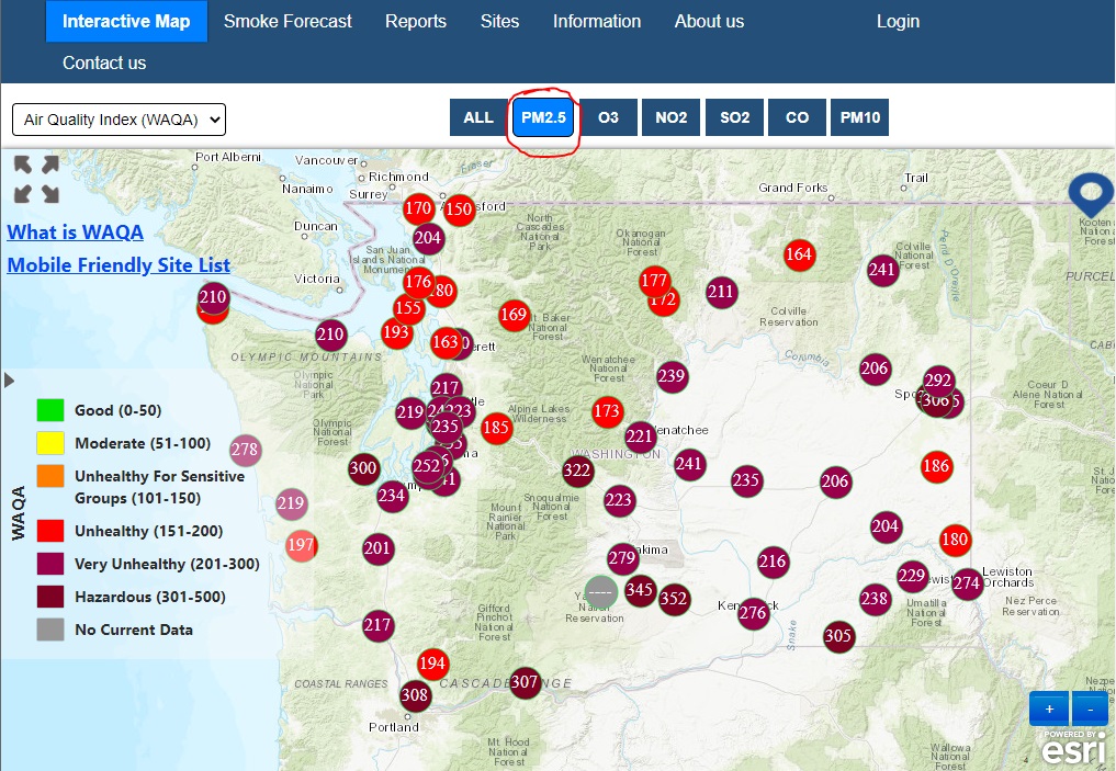
Just PM2.5
The same three cookies
If you’ve found yourself clicking between the state monitoring map and the Washington smoke blog map and wondering why the dots are different colors, you deserve a gold star for being observant – and you’re not alone.
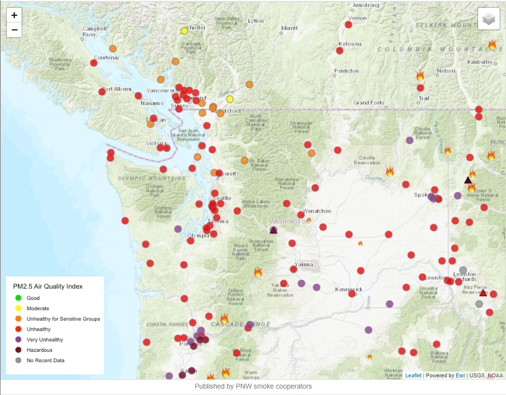
WA Smoke Blog map shows red dots in the Seattle area…

While the state network map shows mostly maroon.
I’ll take a bit of a detour to explain this. Let’s say my daughter eats three cookies. I think that’s too much. My husband says that’s ok, but four cookies would have been too much. Same kid. Same three cookies. Different interpretation of what it means.
In Washington, our assessment of the risk of inhaling particles is more like my interpretation of my daughter eating three cookies, while EPA’s is more like my husband’s assessment that it would take four cookies to be too much. In other words, Washington says particulate is bad for you at a lower concentration over a shorter period of time. The lingo is that our scale is “more protective” of human health. But basically, the needle moves up the Washington scale (called the Washington Air Quality Advisory, or WAQA ) sooner than the federal scale (called the Air Quality Index or AQI). Ecology has a simple table that shows the difference in the scales.
The map on the Washington Smoke Blog shows the AQI, which makes sense when you consider it’s a multi-purpose tool that includes PM2.5, smoke and fire across the nation. So, sadly, the air is the same, even though those federal dots make it look like the air is a little better than the state dots do.
The Purple factor
When I worked for air agencies, a frequent complaint, especially when the air quality was bad, was that there weren’t enough monitors. It was a rare request for government IMBY instead of NIMBY.
More recently, people will helpfully chime in that there are lots of monitors. Monitors everywhere! You just have to know where to look. Then they offer PurpleAir.com.

Monitoring locations on PurpleAir.com website
Indeed, the PurpleAir site shows so many monitors, and those monitors show the air is so much worse! What’s going on here?
The seductive thing about Purple is that the website is so pretty and so easy to use. And it has so many dots! The problem is that good monitoring coverage does not necessarily equate to good data. The dots on the Purple map are essentially crowd-sourced from the air quality hobbyists who bought Purple sensors. These are low-cost particle counters that have a cool upload feature that adds your very own dot to the map. In the words of Olympic Region Clean Air Agency’s Odelle Hadley, these monitors are “very precise, but not very accurate.”
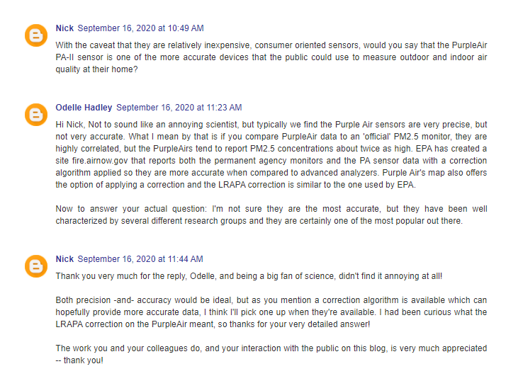
Olympic Regional Clean Air Agency Senior Air Monitoring Specialist Odelle Hadley provides context in response to a question about Purple Air sensors on the Washington Smoke Blog.
But you definitely get the idea when you look at the map, and it’s great to see so many people interested in air quality. Plus, air agencies are starting to use these little devices to supplement their own monitoring programs, which indicates to me that they are useful.
Just keep in mind that this data is kind of like comparing your backyard thermometer with a thermometer calibrated by the National Weather Service – times a million. You see, the monitoring equipment used by state and federal agencies is expensive, complex, precise and accurate, and the people who operate monitoring stations are serious, trained professionals. They calibrate and test and certify everything. If data are in doubt, they throw it out.
Because official monitors are expensive, you aren’t going to start seeing them crop up on every block. But do you need them to? Really? If the official monitor 10 miles away says it’s shitty out, and all the monitors on the West Coast say it’s shitty out, and you open the door and start choking and coughing, it’s probably shitty out.
Unbelievably, this situation doesn’t deter some people from lacing up their sneakers and going for a run. I would be curious to know if these are the same people who want a monitor on their block. But I digress.
Do I think low-cost sensors will take over official monitoring stations? I do not. Do I want one for Christmas anyway? That’s between me and Santa.
Resources
Here are a few of the websites I like to use when the smoke rolls in:
- Statewide monitoring map: Washington Air Monitoring Network (Remember to make sure only PM 2.5 is selected) Check your local air agency site, too. Ecology lists other agency sites. (Special shoutout to Northwest Clean Air, my old stomping grounds – and I oversaw the website redesign, so I think it’s awesome.)
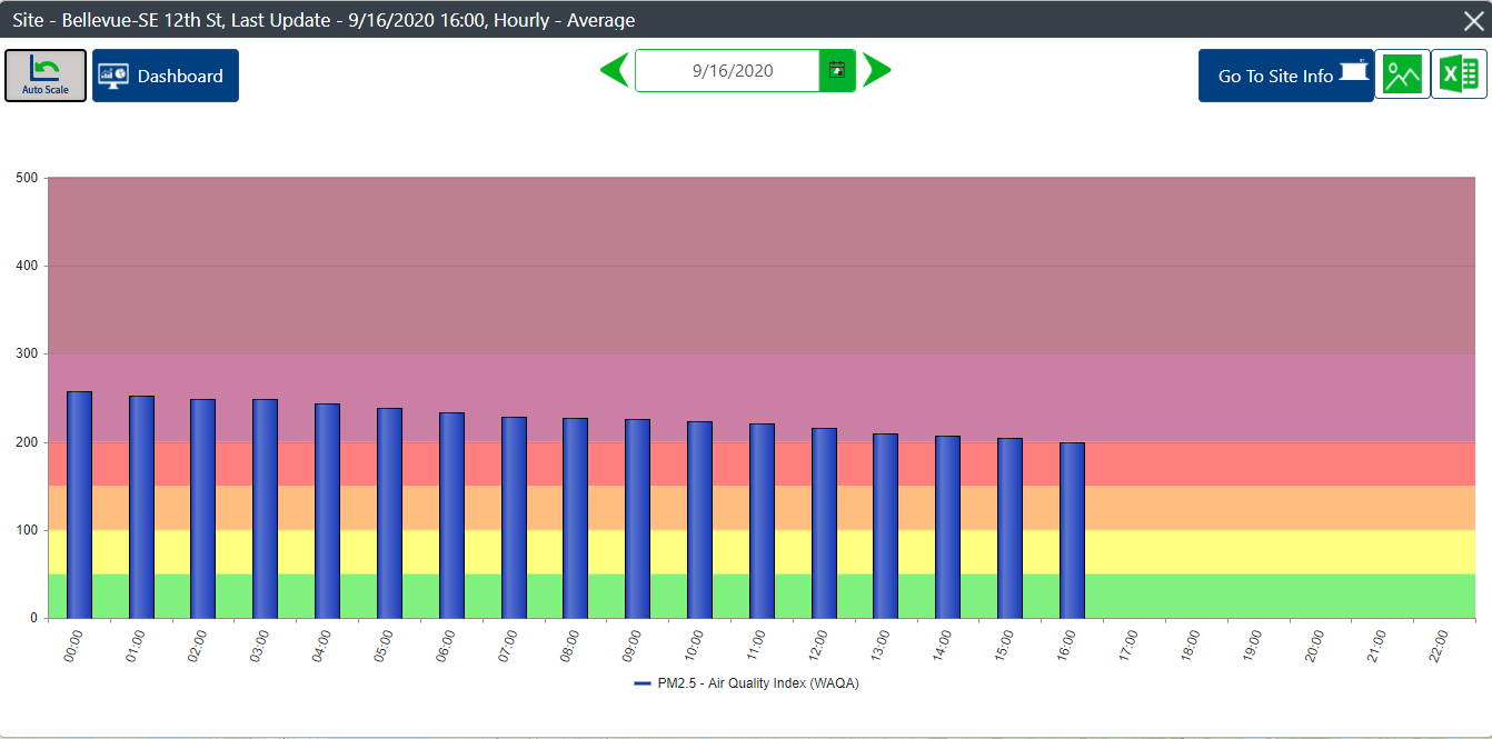
From the Washington Air Monitoring Network map: You can click on a dot and get more info, and if you click on “Go to site info” in the upper right corner…
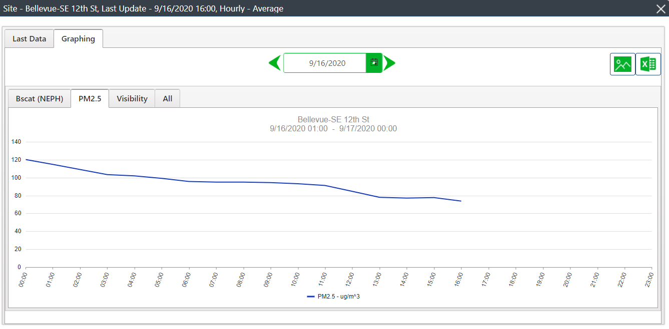
…you can look at hourly readings on a graph.
- Friendly, informative explanation and discussion: Washington Smoke Blog (Real, knowledgeable humans read the comments and respond to you. It’s really delightful.)
- Straightforward chunky forecast: Washington Smoke Forecast
- Cool animated smoke model: US Forest Service BlueSky Daily Runs (Scroll to “Northwest” and choose MAP for PNW 4km or PNW 1.33)
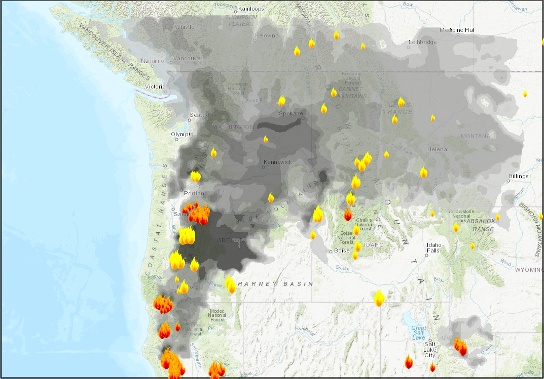
BlueSky Daily Runs is awesome, but be prepared to be disappointed. As we learned this week, models sometimes fake us out.
- IR satellite animation: NOAA GOES-West – Sector view: Pacific Northwest (I don’t know what most of this means, but I like the first one, GeoColor. Select Animation loop. Increase the loop time for a longer animation run.)
- Twitter: @NWSSeattle, @EcologyWA
Safety tips during heavy smoke
- Stay inside with doors and windows closed as much as possible.
- If you must go outside, wear an N95 mask. Surgical masks and that cute mask your friend Susie made for you work well for COVID-19 when combined with physical distancing, but they do nothing for particulate. N95 means the mask is rated to keep out 95 percent of particles 0.3 microns in size. (But keeping out 95 percent of particles when conditions are hazardous means the 5 percent is still high AF.)
- For the love of all things holy, DO NOT GO FOR A RUN.
- For more detailed info about what the air quality scales mean and what to do, there’s a handy table on the Northwest Clean Air Agency site. (When I assembled the information for the health guidance in that table, I never thought I’d need to refer to “hazardous.”)
I’m encouraged to see the numbers appear to be improving. Hang in there, everyone. That deep breath of fresh air is coming soon.

